


These typographic posters started as a means to show off three completely different typefaces, each with different applications that I had the rights to use and how they could be used together. Each poster is predominantly made up of an image, the type itself, and shapes. Both the image and the shapes were there to reinforce the style and characteristics of the type. For example, a picture of a wave was to represent the “curvy-ness” of the typeface lobster. Another systematic element I added to each poster was a comparison to other types whether it be Halis to Futura, Sanchez to Rockwell or Lobster to it’s own alternatives. These comparisons highlighted the unique characteristics of the typeface.

Perfect Putty Please Visit PerfectPutty.net for Full Website Experience.
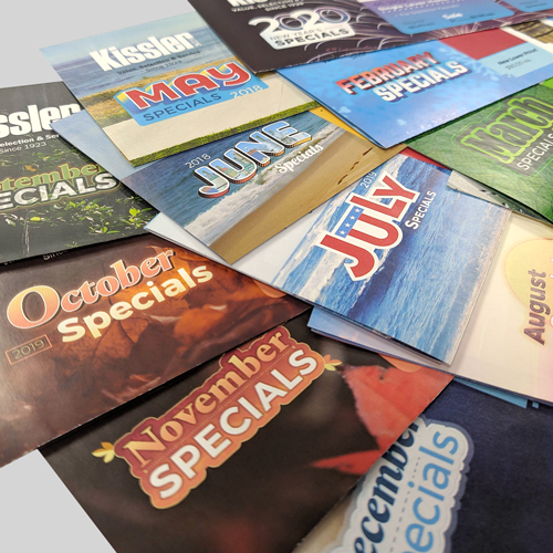
Kissler & Company made the decision to switch from a Bi-Monthly to a monthly special in late 2016. A Clean, legible system of specials that I recently designed for Kissler. I worked on combining multiple typefaces to keep the design interesting but still have it all work together. Each special conveys to the customer all […]

Please Vist www.DominionFaucets.com This was my first commercial web site, designed for Kissler. I worked off of a WordPress theme by Rohit Tripathi. I wanted to ensure a versatile web page, simple enough so that co-workers less knowledgeable of website design could still easily navigate and edit the content. I experimented with PHP Coding and […]
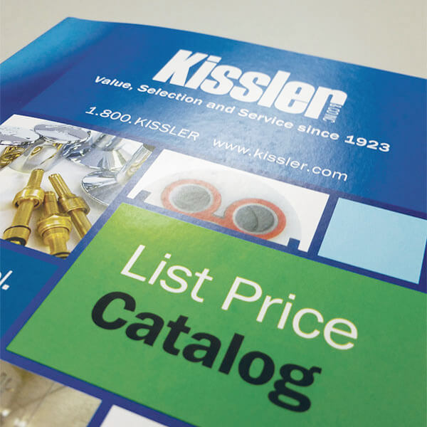
The Kissler Catalog has thousands of products included within its many pages. I had limited photographs to use, and decided to fully redesign the content pages. Striving for a well thought out and recognizable system, I focused on highlighting all of the most important products. In a catalog like this, I felt if it was […]

A Clean, legible system of specials that I designed for Kissler. I worked on combining multiple typefaces to keep the design interesting but still have it all work together. Each special conveys to the customer all of the products that the company currently has on sale, and I wanted to make sure that the information […]
The Future is Now was not only the name of my self developed conference idea but is also its concept. People’s ideas of the future are always changing as technology, culture and their environment change around them. The conference was based around these changes and was spread into 3 separate days, each representing a separate […]
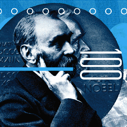
This is the set of bills or “Krona” I did for the country of Sweden. Sweden is a very modern industrial and progressive country so I wanted the bills to reflect that. The concept behind my bills is to show this progressiveness through the past and present history of Sweden. The 100 krona bill design […]